
What Are the 7 C’s of a Website? Complete 2026 Guide
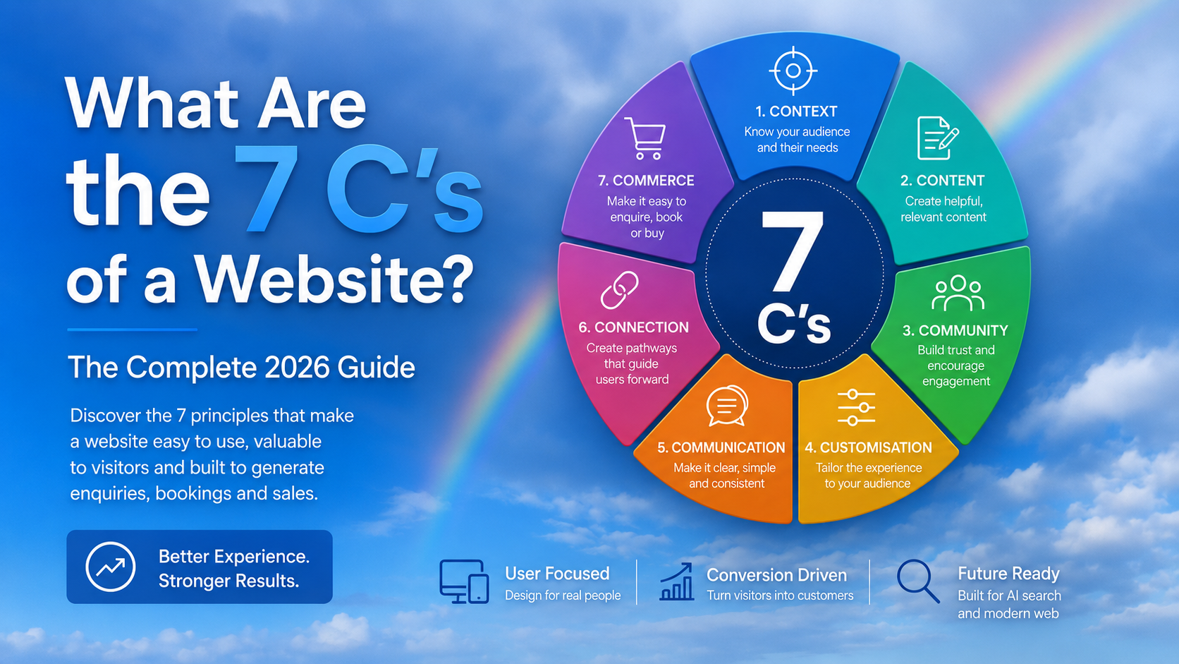
The 7 C's of a website are Context, Content, Community, Customisation, Communication, Connection and Commerce. Together, they provide a practical framework for creating a website that is easy to understand, useful to its visitors and capable of generating enquiries, bookings or sales.
Some websites look impressive for the first few seconds but become frustrating as soon as you try to use them. The service is difficult to understand, the navigation sends you in circles, the contact form asks too many questions or the page never gives you a convincing reason to take the next step.
The 7 C's framework helps explain why this happens. Instead of judging a website only by its appearance, it looks at seven parts of the customer experience and how well they support one another.
This makes the framework useful for business owners as well as designers. You can use it to plan a new website, review an existing one or identify why a site is receiving traffic but not producing enough enquiries or sales.
In this guide, we explain the original 7 C's in plain English, show how each one applies to a modern business website and provide a practical audit you can use on your own site.
What Are the 7 C's of a Website?
The original 7 C's are seven areas used to evaluate the customer-facing side of a website.
Context
The layout, navigation, visual hierarchy and overall way the website is organised and presented.
Content
The text, images, video, product information, service information and other material visitors can consume.
Community
The ways customers and users interact with the business or with one another through the website and connected channels.
Customisation
The website's ability to adapt information, options or pathways to suit different users and needs.
Communication
The exchange between the business and the visitor through forms, email, chat, phone, bookings and follow-up messages.
Connection
The way the site links to related pages, external platforms, useful resources and business systems.
Commerce
The process that allows a visitor to enquire, book, buy, subscribe, pay or complete another action that creates value.
A strong website does not treat these as seven unrelated boxes. The real value comes from getting them to work together.
A clear page layout provides context. Useful service information provides content. Reviews provide evidence of community. A tailored quote form supports customisation and communication. Internal links create connection. A simple enquiry or purchase process completes the commerce journey.
A common point of confusion: You may find articles that include clarity, credibility, consistency, conversion or compliance in their own version of the 7 C's. These can be useful modern website principles, but they are not the original framework covered in this guide.
Where Did the 7 C's Framework Come From?
The framework is commonly associated with Jeffrey Rayport and Bernard Jaworski's work on ecommerce and online customer interface design. It was developed as businesses began moving more of the customer experience from face-to-face interactions onto websites.
Website technology has changed dramatically since then, but the main challenge remains familiar. A business still needs to communicate its value, help customers find what they need and make the next step feel easy and worthwhile.
That is why the framework remains useful. It focuses less on a particular platform or visual trend and more on what the website needs to achieve for both the user and the business.
Why It Remains Useful in 2026
Website platforms, search features and customer expectations continue to change. The seven underlying questions do not:
- Does the website make sense?
- Does it provide the information people need?
- Does it show evidence that other people trust the business?
- Can different visitors find a suitable pathway?
- Can people communicate with the business?
- Are related pages and systems connected properly?
- Can the visitor complete the action they came to perform?
1 Context: Does the Website Make Immediate Sense?
Context is the website's overall structure and presentation. It includes the layout, navigation, page hierarchy, typography, spacing, colours, imagery and visual relationship between different elements.
When context is strong, a visitor can quickly understand where they are, what the business offers and where to go next. The website feels organised without requiring the visitor to think about the organisation itself.
When context is weak, even good information becomes difficult to use. A page may contain everything the customer needs, but poor headings, cramped spacing, confusing menus and competing buttons make the information harder to find.
What Good Website Context Looks Like
- A clear explanation of the business near the top of the homepage
- Navigation labels that use words customers recognise
- A logical structure for services, products, locations and resources
- One clear primary action on each important page
- Consistent buttons, headings, colours and spacing
- Readable text and comfortable spacing on mobile devices
- Important information placed before secondary detail
- Visual elements that support the message rather than compete with it
The Five-Second Context Test
Show your homepage to someone who is not familiar with the business for five seconds. Hide the page and ask three questions:
- What does this business do?
- Who does it appear to help?
- What would you click next?
If the answers are vague or inconsistent, the page probably has a context problem.
Practical example: A Sydney accounting firm's homepage should quickly communicate that it provides accounting services, identify the types of clients it assists and offer a visible path to book a consultation. A large animated graphic may look impressive, but it should not push this essential information out of view.
Common Context Mistakes
- Using a vague opening statement that could describe any business
- Giving every section the same visual importance
- Hiding important services inside large dropdown menus
- Using creative navigation labels customers do not understand
- Designing for desktop and squeezing the layout onto mobile afterwards
- Adding animation or visual effects without a clear purpose
Cloud Web Design applies these principles when creating custom websites for Sydney businesses that need a clearer structure, stronger presentation and better customer pathways.
2 Content: Does the Website Answer Real Customer Questions?
Content is everything a visitor reads, watches, listens to or studies on the website. It includes page copy, product descriptions, images, videos, guides, case studies, reviews, FAQs, pricing information and calls to action.
Good content helps a visitor make a decision. It does not simply fill empty space around the design.
A useful service page should explain what the service is, who it is for, what is included, how the process works, where it is available and what the visitor should do next. It should also address the questions that commonly delay an enquiry.
What Useful Website Content Should Do
- Answer the main question early on the page
- Explain the offer in language the customer understands
- Provide enough detail to support a decision
- Show real examples, experience or results where appropriate
- Address common concerns without sounding defensive
- Use descriptive headings so the page is easy to scan
- Make the next step clear
- Remain accurate as the business changes
Write for the Customer, Not the Internal Team
Businesses often use terminology that makes sense internally but means very little to a new customer. A visitor should not need industry knowledge to understand the service.
For example, “integrated digital transformation solutions” tells a small business owner very little. “We redesign slow or outdated websites so they are easier to find, use and manage” is more direct.
A Useful Content Formula
- State the customer problem clearly.
- Explain the service or solution.
- Show why the business is credible.
- Explain what happens next.
- Provide a clear action.
Different Searches Need Different Pages
Someone comparing website platforms needs different information from someone who already knows they want a Shopify store. Trying to satisfy every search and every customer on one general page usually produces vague content.
That is why Cloud Web Design maintains dedicated pages for WordPress web design , Shopify web design and Squarespace web design . Each platform serves different needs and deserves a focused explanation.
Practical example: A commercial cleaning company should not rely on one paragraph saying it cleans every type of premises. Dedicated pages for offices, medical facilities, warehouses and strata buildings can explain the different requirements and concerns more accurately.
Common Content Mistakes
- Opening every page with a long company history
- Repeating the same generic paragraph across several services
- Making large claims without evidence
- Publishing content only to reach a target word count
- Using AI-generated wording without real experience or examples
- Leaving useful questions unanswered because they seem obvious internally
3 Community: Does the Website Show Real Participation and Trust?
Community originally referred to interaction between website users through forums, message boards and similar online spaces. Today, the idea can be applied more broadly.
For many businesses, community is demonstrated through customer reviews, project stories, comments, user-generated photos, social communities, events, member areas and repeat customer participation.
Not every business needs a public forum. A local electrician does not need to build a discussion board simply to satisfy the framework. The more relevant question is whether the website shows that real people use, trust and engage with the business.
Modern Community Features Can Include
- Verified customer reviews
- Detailed client testimonials
- Project case studies
- Customer photos or videos
- Comments on useful articles
- Member or client portals
- Events, workshops or webinars
- Social media content connected to the website
- Customer questions answered publicly
Community Is More Than a Row of Star Icons
Reviews are more useful when they contain detail. A short statement saying “great service” provides less insight than a review explaining the customer's original problem, the service received and the result.
Case studies are especially valuable because they allow a potential client to recognise a situation similar to their own. They show how the business handles real work rather than relying only on broad marketing claims.
You can see this approach in the Cloud Web Design portfolio , which includes websites created across WordPress, Shopify, WooCommerce and Squarespace.
Practical example: An online clothing store could invite customers to upload photos showing how garments fit in everyday use. A professional service firm may be better served by detailed client stories explaining the challenge, process and result.
Common Community Mistakes
- Using anonymous testimonials with no useful detail
- Displaying old social feeds that have stopped updating
- Publishing feedback that feels too perfect or unrealistic
- Creating a community feature without a plan to manage it
- Allowing spam or irrelevant comments to reduce trust
4 Customisation: Can Different Visitors Find a Suitable Path?
Customisation is the website's ability to adapt the experience to different users or allow people to choose information that is relevant to them.
This does not always require sophisticated personalisation software. For a small business website, customisation may be as simple as providing separate pathways for homeowners, builders and commercial clients.
Examples of Website Customisation
- Product filters for size, colour, price or use
- Separate service pathways for different customer groups
- Quote forms that reveal relevant questions based on earlier answers
- Customer accounts with saved details or order history
- Location pages containing locally relevant information
- Recommended resources based on the page being viewed
- Saved carts, wish lists or comparison tools
- Language, display or accessibility preferences
Useful Customisation Reduces Work
A customised experience should make the website easier to use. It should not force the visitor to create an account, answer unnecessary questions or share personal information simply to view basic details.
Good customisation removes irrelevant choices. Poor customisation adds more steps and calls the result personalisation.
Practical example: A construction company may work with homeowners, architects and commercial developers. Giving each audience a clear pathway helps visitors reach suitable project examples, capabilities and enquiry questions without searching through unrelated material.
Common Customisation Mistakes
- Requiring an account before showing useful information
- Using intrusive pop-ups based on weak assumptions
- Collecting more personal information than the experience requires
- Adding filters that return confusing or empty results
- Showing location-specific information that is inaccurate
- Making the experience technically impressive but slower to use
5 Communication: Is It Easy to Ask a Question and Receive a Response?
Communication is the exchange between the business and its website visitors. It includes contact forms, telephone links, email, live chat, booking systems, confirmations, newsletters and follow-up messages.
A website is not communicating effectively simply because a contact page exists. Visitors need to know how to reach the business, what information is required and what is likely to happen after they make contact.
Good Website Communication Includes
- Visible contact options on important pages
- Click-to-call links that work properly on mobile
- Forms that request only necessary information
- Clear labels and helpful error messages
- A confirmation after an enquiry, booking or payment
- Realistic expectations about response times
- Consistent information across the website
- A reliable process for answering enquiries
The Form Is Part of the Customer Experience
Contact forms often receive less attention than the visual design, even though they are one of the most important conversion points on a service website.
Every additional field creates a small decision. Some fields are necessary, but many forms ask for information that could be collected after the first conversation.
Review Your Main Enquiry Form
For each field, ask:
- Do we genuinely need this information before responding?
- Does the visitor understand why we are asking?
- Is the field easy to complete on a phone?
- Could this question wait until the first conversation?
A confusing enquiry process is one reason a website can attract visitors without generating enough leads. Our guide on fixing a website that gets traffic but no enquiries explains the other common causes.
Practical example: A customer requesting a website quote should not need to prepare a complete technical specification. A short form can collect the business name, website address, main goal, preferred platform if known and contact details. The remaining questions can be discussed during the initial conversation.
6 Connection: Are the Website's Pages and Systems Properly Linked?
Connection describes how the website relates to other pages, platforms, resources and systems. This includes internal links, external references, social profiles, maps, payment providers, booking tools, email platforms, analytics and customer management software.
Strong connection helps the visitor continue their journey without reaching a dead end. It also helps search engines understand the relationship between different pages.
Useful Website Connections Include
- Links between related services and articles
- Links from general pages to more specific information
- Links from educational content to suitable service pages
- Secure connections to booking and payment systems
- Google Business Profile and map information where relevant
- Email and enquiry management integrations
- Analytics that measure meaningful actions
- External references that genuinely help the reader
Internal Linking Should Feel Natural
Internal links should help the reader answer the next logical question. They should not be inserted randomly simply because a keyword appears in the sentence.
A guide comparing website platforms can naturally link to detailed WordPress, Shopify and Squarespace service pages. A location page can link to the relevant services available in that area.
Practical example: A Sydney CBD business reading about website structure may also need information about local support and service delivery. A relevant link to web design services for Sydney CBD businesses provides a useful next step.
More Integrations Are Not Always Better
Every third-party tool adds another system to maintain. It may also add scripts, introduce privacy considerations or affect loading performance.
An integration should remain only when it serves a clear customer or business purpose. Old chat tools, abandoned social widgets and duplicate tracking systems often create more problems than value.
7 Commerce: Can the Visitor Complete the Intended Action?
Commerce is the transactional part of the website. It is often associated with online stores, but it also applies to service businesses.
A transaction may be a purchase, quote request, consultation booking, application, donation, subscription or another action that creates value for the visitor and the organisation.
The central question is simple: can the visitor complete what they came to do without unnecessary confusion or effort?
Commerce Elements Can Include
- Clear service, product or package information
- Useful pricing or cost guidance
- Prominent enquiry, booking or purchase buttons
- Product selection and shopping cart tools
- A secure, mobile-friendly checkout
- Payment and delivery information
- Returns, cancellation and service policies
- Trust information close to important decisions
- Order, booking or enquiry confirmation
Reduce Friction Without Removing Necessary Detail
A simple process does not mean removing every question or warning. It means keeping the steps that improve accuracy, security or customer confidence and removing the steps that exist only because that is how the form was originally set up.
For an ecommerce store, this may involve simplifying product choices, making shipping costs clear and reducing checkout distractions. For a service business, it may involve improving the quote form and explaining the next step.
Practical example: A customer should not reach the final checkout step before discovering an important shipping restriction. A service customer should not submit an enquiry and then wonder whether the message was received.
The Platform Should Suit the Transaction
Different website platforms are suited to different commercial needs. WordPress can provide extensive flexibility for service content and custom functionality. Shopify is built around product management and ecommerce transactions. Squarespace can suit smaller service and creative websites that value straightforward content management.
The right decision depends on what the website needs to do, not which platform happens to be receiving the most attention. Our custom web design service considers the customer journey, content requirements and business model before recommending a platform.
How the Seven Elements Work Together
A website can perform well in one area and still fail because another area breaks the customer journey.
Excellent content cannot rescue a confusing layout if visitors never find the information. Strong reviews cannot overcome a checkout that fails on mobile. A beautiful design cannot generate enquiries when the service remains vague.
Two ideas are especially useful when reviewing the framework.
Fit
Fit means each element suits the website's purpose and audience. A community news website and an industrial equipment supplier should not apply the seven elements in exactly the same way.
An ecommerce store may place greater emphasis on customisation and commerce. A professional service firm may focus heavily on content, communication and trust. A membership organisation may need stronger community features.
Reinforcement
Reinforcement means the elements support one another. The page design should make the content easier to understand. The content should lead naturally to communication. Reviews should reduce doubt near the enquiry or purchase point. Internal links should connect the visitor with the next useful page.
A Strong Customer Journey Might Look Like This
- The visitor immediately understands the business and page purpose.
- The content answers their main questions.
- Reviews and project examples build confidence.
- The page provides information relevant to their situation.
- A clear contact option appears at the right moment.
- Related pages provide any additional detail required.
- The visitor completes the enquiry, booking or purchase.
How the 7 C's Apply to Different Types of Websites
The framework is flexible. What changes is the way each C is expressed.
Service Business
Clear service structure, helpful explanations, reviews, relevant enquiry pathways, direct communication, internal links and an easy quote process.
Ecommerce Store
Intuitive categories, detailed product content, customer reviews, useful filters, order communication, secure integrations and a simple checkout.
Content Website
Logical topics, original articles, reader participation, recommendations, newsletters, related links and a suitable subscription or membership model.
| 7 C | Service business example | Ecommerce example | Content or membership example |
|---|---|---|---|
| Context | Services grouped by customer need | Clear product categories and filters | Logical topics and article navigation |
| Content | Service details, process and case studies | Product descriptions, images and sizing | Original articles, videos and resources |
| Community | Reviews and client stories | Ratings and customer photos | Comments, forums or member discussions |
| Customisation | Pathways for different client types | Filters, recommendations and saved carts | Saved topics or personalised feeds |
| Communication | Quote forms, calls and consultations | Order updates and customer support | Newsletters and member notifications |
| Connection | Service, location and case study links | Payments, inventory and shipping tools | Related articles and contributor profiles |
| Commerce | Enquiry or booking process | Cart, checkout and payment | Subscription, donation or membership |
What Does a Modern Website Need Beyond the Original 7 C's?
The original framework is a useful strategic foundation, but it is not a complete technical checklist for a modern website.
A website built today also needs to account for performance, mobile usability, accessibility, security, privacy, search visibility and accurate measurement.
1. Fast and Stable Performance
Visitors should not need to wait while oversized images, unnecessary scripts or decorative effects load. Pages should also remain visually stable so buttons and text do not move while someone is trying to use them.
2. Mobile Usability
Mobile design is not simply a smaller version of the desktop page. Menus, forms, buttons, tables, text and media need to be reviewed for the way people actually use a phone.
3. Accessibility
Websites should be designed so more people can perceive, understand and use the content. This includes readable colour contrast, keyboard-friendly controls, alternative text for meaningful images, descriptive links and properly labelled forms.
The Web Content Accessibility Guidelines provide an established reference for improving digital accessibility.
4. Security and Privacy
Forms, customer accounts, payments and website software need appropriate protection. Businesses should also be transparent about how personal information is collected and used.
5. Clear Search Structure
Important pages need unique titles, descriptive headings, useful internal links and crawlable text. Search optimisation should support the customer experience rather than making the writing repetitive or unnatural.
6. Trust and Transparency
Visitors should be able to identify the business, its location or service area, how to make contact and who is responsible for the content. Genuine project examples, policies and business information can strengthen confidence.
Cloud Web Design explains its experience and approach on the About Cloud Web Design page rather than leaving readers to guess who is behind the business.
7. Meaningful Measurement
Website reporting should focus on actions that matter. Traffic can be useful, but it does not automatically mean the website is creating a business result.
Useful measurements may include qualified enquiries, telephone calls, bookings, completed checkouts, repeat purchases, form completion rates and the pages that assist these actions.
How Do the 7 C's Support Google Search and AI Search?
The 7 C's are not a Google ranking formula. Completing a seven-point checklist does not guarantee a particular position in search results.
However, the framework encourages many qualities that make a website more useful and easier to understand.
- Context supports clear page and website structure.
- Content provides answers to relevant questions.
- Community can show real experience and customer trust.
- Customisation helps users reach relevant information.
- Communication makes the next step clear.
- Connection links related pages and resources.
- Commerce creates a clear conversion pathway.
What About AI Search?
Websites do not need a separate set of tricks for every new AI search feature. The strongest approach remains publishing useful, accessible and clearly structured information that answers real questions.
An article or service page is easier to understand when it:
- Provides a direct answer near the beginning
- Defines the subject precisely
- Uses descriptive headings
- Includes original experience and practical examples
- Answers useful follow-up questions
- Connects to relevant supporting pages
- Clearly identifies the business behind the content
- Keeps important information in visible, crawlable text
Structured data can help search systems understand what a page represents, but it should accurately describe visible content. It is not a substitute for a clear and useful page.
Read our guide to Google's AI search reporting and what it means for Sydney businesses for a broader explanation of AI-powered search visibility.
Be careful with ranking promises. Search performance also depends on competition, website authority, technical quality, relevance, links, indexing and how well the page satisfies the search. The objective should be to publish the most useful result, not simply the longest article.
How Can You Measure Each of the 7 C's?
Each C can be reviewed using a mixture of observation, customer feedback and website data. No single metric tells the complete story.
| Area | Questions to ask | Useful evidence |
|---|---|---|
| Context | Can a new visitor understand the page and find the next step? | User testing, navigation paths, mobile checks and page recordings |
| Content | Does the page answer the questions that matter before a decision? | Search queries, sales questions and customer feedback |
| Community | Does the site show genuine customer participation and trust? | Reviews, case studies and user-generated content |
| Customisation | Can different users reach information relevant to their needs? | Filter use, pathway selection and form completion |
| Communication | Can visitors contact the business and receive a clear response? | Form completion, response times and failed submissions |
| Connection | Do links and integrations support the visitor's journey? | Link clicks, broken-link checks and integration errors |
| Commerce | Can visitors complete the intended action without avoidable friction? | Conversion rates, checkout exits and enquiry quality |
Numbers require context. A short visit is not automatically bad if the visitor finds the telephone number immediately. A long visit is not automatically good if the person spends five minutes trying to locate basic pricing information.
7 C's Website Audit Checklist
Review your homepage, main service or category pages, highest-traffic landing pages and main enquiry or checkout process.
Score Your Website Against the 7 C's
Give each area a score from one to five. A score of one means it creates a serious obstacle. A score of five means it works clearly and consistently across the website.
Start with the lowest score that directly affects customer understanding or conversion. Improving context, content or communication will often have more impact than adding another visual effect or marketing tool.
A Practical 30-Day Website Improvement Plan
You do not need to rebuild the entire website at once. Use the framework to make focused improvements over four weeks.
Week 1: Fix Context
Review the homepage message, navigation, mobile layout and calls to action. Remove distractions that compete with the main purpose of each page.
Week 2: Improve Content and Community
Rewrite the most important service or product page around customer questions. Add a genuine review, project example or case study that supports the claims on the page.
Week 3: Review Customisation, Communication and Connection
Create clearer pathways for different customers, simplify the main form and add internal links to useful pages. Remove outdated or unnecessary integrations.
Week 4: Improve Commerce and Measurement
Test the complete enquiry, booking or checkout journey on a phone. Fix confusing steps and confirm that important completed actions are being measured accurately.
Related Cloud Web Design Guides and Services
Frequently Asked Questions
What are the original 7 C's of a website?
The original 7 C's are Context, Content, Community, Customisation, Communication, Connection and Commerce. They provide a framework for evaluating the customer-facing experience of a website.
Who created the 7 C's website framework?
The framework is commonly associated with Jeffrey Rayport and Bernard Jaworski's work on ecommerce and online customer interface design.
Is compliance one of the original 7 C's?
No. Compliance is an important modern website consideration, but the original seventh element is Commerce. Some newer versions use altered lists that include compliance, clarity or credibility.
Are the 7 C's still relevant in 2026?
Yes. They remain useful for reviewing website structure, information, customer participation, communication and conversion. They should now be combined with mobile usability, performance, accessibility, security, privacy and modern search practices.
Which of the 7 C's is the most important?
There is no single most important C for every website. Context and content are foundational because visitors first need to understand the website and its offer. The remaining priorities depend on the audience and business model.
Do all websites need strong commerce features?
Commerce does not need to mean an online checkout. For a service business it may be the quote, booking or consultation process. Every business website should make its intended action clear and easy to complete.
How do the 7 C's help website SEO?
They are not a direct ranking formula, but they encourage clear structure, useful content, relevant internal links, customer evidence and better user journeys. These qualities can support a stronger overall search strategy.
Can the 7 C's help with AI search visibility?
They can help create clearer and more useful pages. Direct answers, descriptive headings, original examples, accurate information and relevant internal links make content easier for people and search systems to understand.
Can a small business use the framework without a large budget?
Yes. A small business can begin with clearer navigation, more useful service information, genuine reviews, visible contact options, helpful internal links and a simpler enquiry process.
How often should a website be reviewed?
Important pages should be checked whenever services, products, prices, locations or customer processes change. A broader review every three to six months can identify outdated information, broken links, mobile problems and conversion obstacles.
What is the difference between communication and connection?
Communication is the exchange between the business and the visitor, such as forms, calls, chat and follow-up messages. Connection describes how the website links with related pages, external resources, platforms and business systems.
Should a website redesign address all seven areas?
A redesign should review all seven areas, but they will not always require equal amounts of work. Priorities should be based on the site's purpose, customer needs and the problems affecting performance.
Need More Enquiries From Your Website?
Cloud Web Design helps Sydney businesses build fast, mobile-friendly and SEO-focused websites designed for stronger Google visibility, greater trust and more enquiries.
Contact Cloud Web Design